PRI adds piece of flare with new logo

And the winner is...
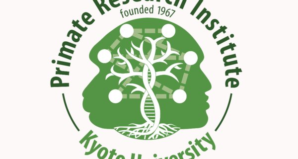
During summer of 2017, PRI ran an open competition for a new logo design. From among a strong pool of submissions, a winner has finally emerged and will begin spicing up relevant websites and business cards in early 2018. Congratulations go to former PRI Internship student Elodie Thomas (MSc 2013) and current PhD student Cecile Sarabian for their winning entry!


Below is the (slightly modified) designers' description of the logo's meaning...
The roots remind us of a connected past, while the tips of the branches promise a divergent future. The twisted trunk also expresses the importance of genetics shaping the future of our evolution, as well as the field of Primatology, with a resemblance to DNA supercoiling. The tree is a nod to the Kyoto University logo and symbol, the kusunoki tree that sits out front Kyoto University's Clock Tower. The dots (nodes) and dashed lines (connections), taken from social network analytics, reflect the interdisciplinarity we can find in the field of Primatology and at the Primate Research Institute. The two profiles, generic primate on one side and human on the other, are there to remind us how the study of non-human primates contributes to a better understanding of ourselves.


